Penguin, Panda, Mobilegeddon, Pirate, Hummingbird, and my personal favorite… Boston.…
Considering a Logo Redesign
A logo redesign is about as fun as it gets in the marketing world, but in most cases, we should set aside our excitement and come at it from a different angle.
When I got my first big marketing position, the CEO approached me and asked me to change the logo. I had been working in a very cool and dynamic design firm so I jumped at the opportunity! When it comes to tasks assigned to the marketing department, a logo redesign is pretty much the holy grail of projects. I’ve be fortunate to be involved with several logo designs, but, while they were fun projects, I regret the redesigns that I’ve been a part of.
A logo carries with it brand recognition which translates into brand equity.
Here are a few examples of partial logos. Can you guess who they are? For a marketing geek, this is like a good Sudoku puzzle. Just picture the Tripp kids gathered around the kitchen table guessing logos like this, that, or this.
What is it worth to a company, not just to have brand recognition from a logo, but brand recognition from a partial logo? When we overhaul a logo for a “fresh look,” a “younger customer base” or because “I’m sick of looking at it” we sacrifice real brand equity for fabricated, or at least mis-placed, reasons.
Now, there are of course exceptions. For a company mired in scandal or some other devastating internal turmoil with outside implications, a logo change may not be enough. You might be looking at a name change to save the day (See my article on name changes).
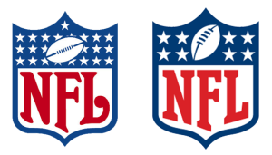
Consider instead how some companies have made logo changes that evolve the brand, but protect the equity. My absolute favorite example is the NFL logo. All of the brand equity was maintained, but significant gains were made in meaning and ease of use.
GE with over a century of brand equity and UPS are other examples of making small and deliberate changes that maintain brand equity and achieve other goals the company has.
There is no doubt that GE could spend a few million and come up with a MUCH better logo with deep hidden meaning and a 21st century glow, but it would be at the expense of billions of dollars of brand equity.
I was faced with something similar working at Chaney Enterprises. Upon arriving, I found easily a dozen varieties of the logo, so this was a chance to reel things in, modernize slightly and most importantly, maintain incredible brand equity.
Re-working a logo is a blast, but when considering the project, put all the excitement in the back seat and take a deep look at the WHY behind the change and ask yourself what impact it has on brand equity. If you determine that a wholesale change will not impact brand equity, then I would question why on earth you have no visual brand equity! A deep look in the mirror may reveal that a logo change will not solve your troubles. There have been many memorable logos out there, but the logos are not memorable because they are so great. They are memorable because great things were done with them.
I’d love to more examples of great logo redesigns that maintain brand equity. Post away or send them my way!
Next Post: NFL Logo Change
Previous Post: Brevity in Business


