There is a big misunderstanding in the world about marketing. …

NFL Logo Change
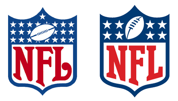
I have long admired the way that the NFL changed their logo several years back in 2007 and even included in a post on logo redesigns. I thought I’d breakdown a few of the things they did that make this one of the best logo change executions I have ever seen.
Most importantly, they completely preserved brand equity. Most NFL fans would never know, or need to know that the logo changed. Internal brain trusts and focus groups crammed with passionately loyal fans, ensured a flawless launch.
Stars
 After a great deal of research, NFL executives could not find and meaning behind the number of stars in the upper part of the shield. Additionally, partners who licensed the NFL logo had great difficulty reproducing the stars correctly, particularly in embroidery executions. The decision was made to reduce the number of stars. They now represent the eight divisions to which NFL teams are assign, divided into the AFC and NCF on either side of the shield.
The Football
 The old “hamburger” football (as it was somewhat affectionately called in the halls of the NFL) had a dated look. By placing the football on an angle, it gave the logo element a more dynamic look and more closely resembles the coveted Lombardi superbowl trophy.
Color
The blue went from a pale blue, to a deeper, more patriotic and bold blue.
Lettering
 The NFL lettering was cleaned up and transitioned to a more modern shaping, while still maintaining the classic feel of an historically rich organization.
Hats (and helmets) off to the team that pulled of this phenomenal NFL logo change. This is a case study of the right way to update a logo and has served a model for me as I’ve worked on similar projects.
Previous Post: Considering a Logo Redesign


